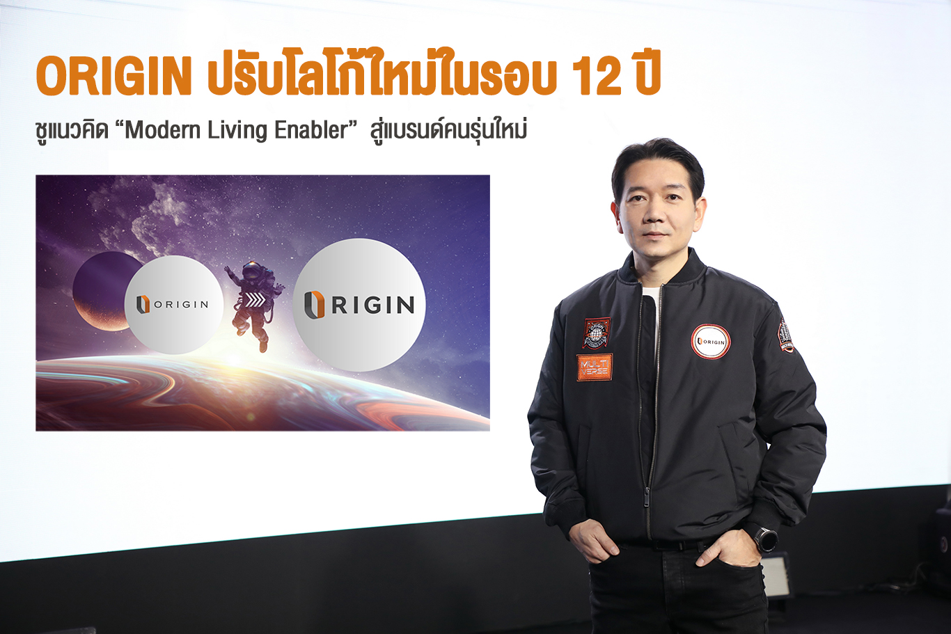
Origin Unveils New Logo for the First Time in 12 Years, Emphasizing the Concept of 'Modern Living Enabler' for a New Generation
"Origin Property" has revamped its logo for the first time in 12 years under the concept of "Modern Living Enabler," transforming from a classic English-style condominium brand logo to a comprehensive real estate brand for the new generation, addressing modern living needs for all generations while reinforcing the growth direction of the Origin Multiverse.
Mr. Pirapong Jarunek, CEO of Origin Property Public Company Limited (ORI), a comprehensive real estate developer, revealed that the first step of Origin Property began with a commitment to developing condominium projects with classic English style, resulting in the company's initial logo being designed with a classic flair. Consequently, the brand names of the company's early condominium projects were based on names of cities in England, such as Kensington, Notting Hill, and Knightsbridge.
However, the company has now grown through various paths, with numerous new condominium and housing brands emerging, continuously expanding into new businesses that comprehensively address people's modern living needs. As the company celebrates its 12th anniversary, it is an opportune time to unveil a new logo for the first time under the concept of "Modern Living Enabler" to encompass the new direction the company is heading.
"Today, we no longer only have classic English-style brands. Since 2019, we have continuously launched new condominium brands such as The Origin, Origin Plug & Play, and So Origin, focusing on modernity to meet the needs of the new generation, including Gen Y, Gen Z, and startups. At the same time, we are expanding into new segments and new businesses such as logistics, healthcare, finance, and insurance, covering modern living for all generations. This logo redesign is another significant step and a symbol reaffirming our commitment to modern living," Mr. Pirapong stated.
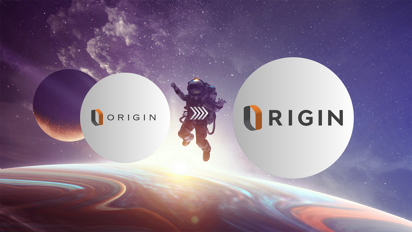
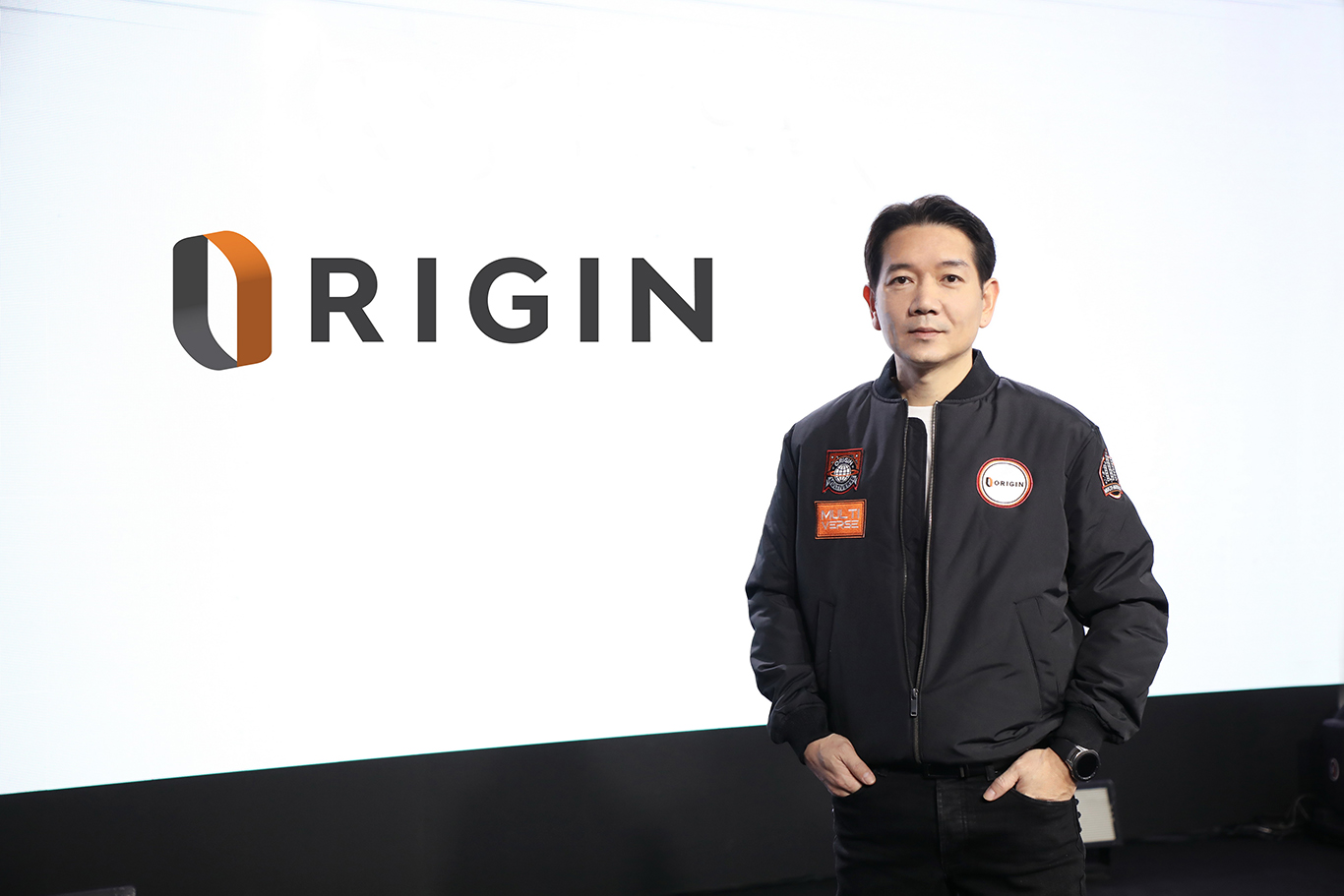
The new logo under the concept of "Modern Living Enabler" features significant changes in three main areas from the previous logo: 1. Font Change - transitioning from a serif font, which conveys a classic and English style, to a more rounded, bolder font for clarity, ease of reading, and modernity, making it easier to communicate with the new generation; 2. Logo Symbol Modification - shifting from sharp angles representing strength to a modern rounded design that aligns with current global changes; and 3. Reducing Redundancy - by removing the letter 'O' and allowing the logo's 'O' to represent the original letter, reflecting a modern lifestyle that seeks to reduce redundancy and desires multifunctional capabilities.
Mr. Pirapong further stated that the new logo aligns with the company's direction this year, which is advancing the Origin Multiverse plan, or the multiverse growth strategy aimed at connecting all separate universes back to collectively care for consumers as an ecosystem, creating a Multiverse of Happiness that comprehensively enhances the quality of life for consumers.
The Origin Property Public Company Limited (ORI) has a diverse business structure, including:
1. Residential Development Business - having developed 98 projects (as of the end of 2021), such as the PARK ORIGIN brand, The Origin, Origin Plug & Play, KnightsBridge, Notting Hill, Kensington, Hampton, and BRITANIA, with a total project value exceeding 143.8 billion baht.
2. Recurring Income Business - including hotels, serviced apartments, and retail.
3. Service Business - such as property management, real estate brokerage, real estate consulting, and a vision for continuous expansion into new business types, including logistics, asset management, energy, healthcare, etc., to enhance the quality of life for consumers comprehensively. Currently, the company's market capitalization is approximately 30 billion baht, while Britannia Public Company Limited has a market capitalization of about 10 billion baht.